Mika Matcha

Objective
To create a brand identity by developing a logo and packaging design for Mika Matcha, a matcha powder brand. The goal was to create a brand that felt earthy and natural, while maintaining a degree of minimalism and simplicity.
Client
Concept
Role
Graphic Designer
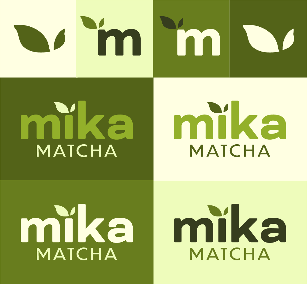
The goal was to develop a clean, modern identity for Mika Matcha, built around a layered green color palette inspired by matcha leaves. A simple two-leaf icon functions as both a standalone brand mark and a custom element within the sans-serif logotype. Emphasis on “mika” establishes the brand name as the focal point, while multiple logo and color variations allow for flexibility across applications.